You Landed. Your Carrier Didn’t
Vivo Travel has been voted Brazil's best international roaming service seven years running. This is the story of the UX gaps that existed behind that reputation, and how we closed them.
■ At this time I was working within both the Telefônica Brasil and Work&Co teams to resolve it.
How It Started
This project wasn't supposed to be a redesign. It began as a brief oversight of Work&Co's large-scale redesign of Vivo's app. A check-in, essentially. Vivo Travel was one module among many, and since the service is used exclusively outside Brazil, it had naturally received less attention from teams operating domestically on both sides.
What I found when I looked closely was a service with real gaps. Not catastrophic ones, the bones were there. But the kind of quiet, compounding problems that erode trust exactly when a customer is most vulnerable: abroad, possibly stressed, relying on their phone to navigate somewhere unfamiliar.
Vivo Travel is Vivo’s international roaming service. And for good reason, it has since been voted Brazil’s best international roaming by Datafolha’s Viaja SP survey seven years in a row. But in 2021, the experience wasn’t living up to that reputation.
What Was Actually Wrong
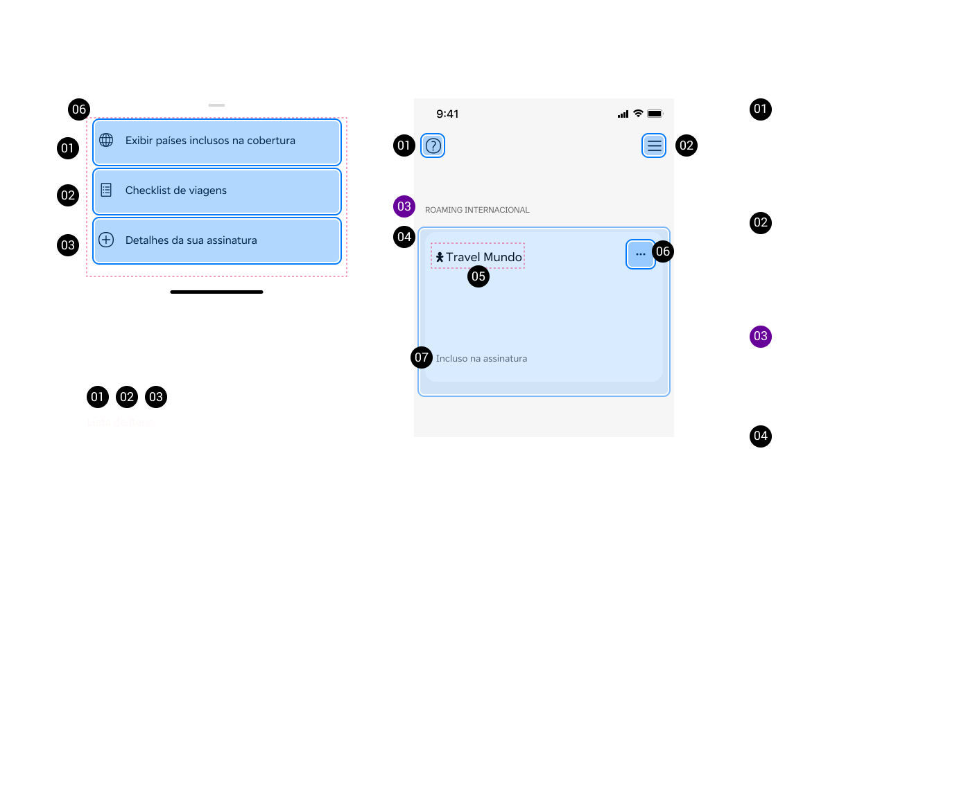
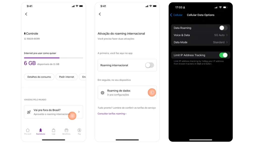
To turn on roaming, users had to navigate through device settings rather than doing it directly from the app.
For someone landing at an airport in a country they don't know, hunting through phone settings is not a good experience. It's the kind of friction that sends people straight to customer support: or straight to a local SIM card instead.
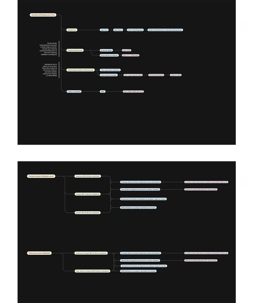
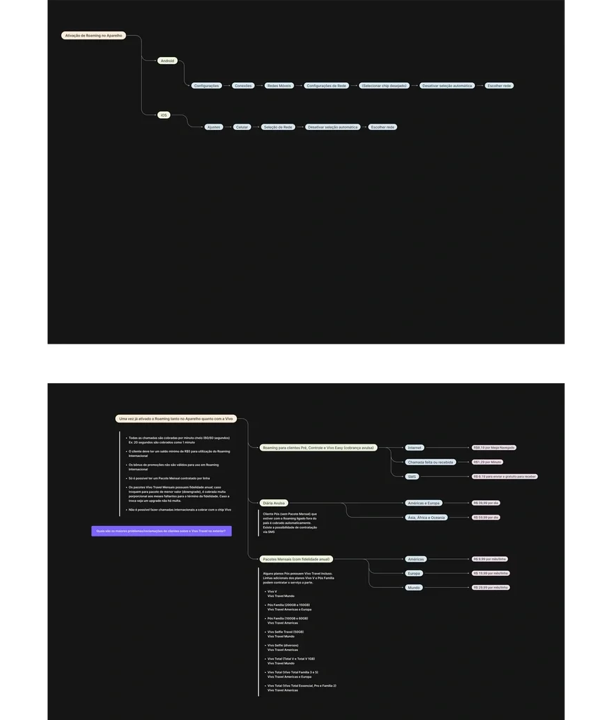
The device settings map (top left) comes from screens visible to any user. The other three are original analysis, exported at reduced resolution on purpose: structure visible, figures and labels not.
To turn on roaming, users had to navigate through device settings rather than doing it directly from the app. For someone landing at an airport in a country they don't know, hunting through phone settings is not a good experience. It's the kind of friction that sends people straight to customer support: or straight to a local SIM card instead.
Activation was buried
The service described itself using 'monthly subscription' language, when the actual commitment was annual. That's not a small discrepancy. It's the difference between a customer feeling informed and a customer feeling deceived — and it was generating a steady stream of complaints and support calls from people who hadn't understood what they'd signed up for.
The contract language was misleading
Key information was ambiguous
Duration of packages, eligibility criteria and what exactly was covered where — all of it required more effort to understand than it should have. Users were making decisions about international plans without a clear picture of what they were buying.
What We Did About It
The most immediate fix was the Roaming Activation Hub, a direct shortcut built into the app that unified the two sides of activation: Vivo's side and the device's side. A travel prompt on the home screen leads to Vivo's toggle, then deep-links straight into the phone's settings. Before this, users had to find that path on their own. Simple in concept, meaningful in practice. The moment of needing to turn on roaming is rarely a calm one.
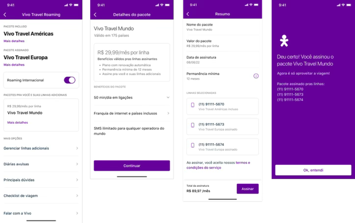
On the content side, I ran a UX content study with A/B testing to find the language that actually worked. Not the language that made sense to the product team, but the language that landed correctly with users making quick decisions in high-friction moments. 'Monthly subscription' became accurate annual contract language. Eligibility and package duration were rewritten for clarity, not comprehensiveness.
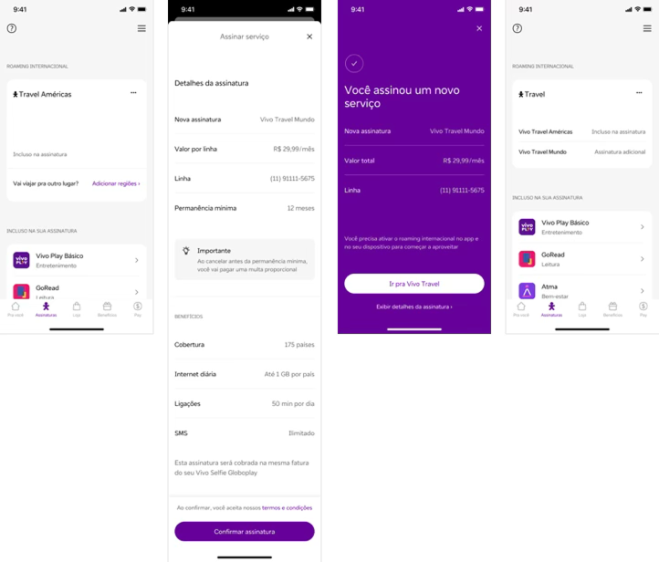
To align both teams on what the experience needed to do, I also created detailed flowcharts covering the essential processes for both daily and annual roaming packages. When two separate teams are working on the same product from different companies and different vantage points, shared documentation isn't a nice-to-have — it's what keeps things from drifting apart again.
The Outcome
That last number is worth pausing on. When users could actually understand what Vivo Travel offered and activate it without friction, more of them chose to upgrade. Clarity didn't just reduce complaints — it became a commercial opportunity.
18%
Increase in user satisfaction with clearer contract terms
15%
Reduction in customer support inquiries related to roaming activation
12%
Increase in prepaid-to-postpaid upgrades among users exploring Vivo Travel
What this project was really about
International roaming is one of those features that reveals a lot about how a company thinks about its customers. The assumption built into the original experience was that users would figure it out — that they'd read carefully, navigate patiently, and sort out the settings themselves.
People don't do that under normal circumstances. They certainly don't do it when they've just stepped off a long-haul flight.
The fixes here weren't technically complex. What they required was someone willing to look at the experience from the outside, call out what wasn't working, and do the unglamorous work of getting two separate teams aligned on language, logic, and user flow. That's most of what good UX work actually is.
This project changed my own path too. It's the work that led Vivo to hire me directly. A routine check-in, taken seriously, turned into the door I walked through.