The Billion-Dollar Form
A form nobody wants to fill out, that carries consequences most people don't fully understand. Here's how I tried to make it better.
■ This project was developed during my tenure at Sami Saúde, a Brazilian healthtech. I have moved on before completing the final usability tests, so some hypotheses raised throughout the process remain unvalidated. The process itself is worth sharing.
Why a Health Statement Form Is More Important Than It Looks
If you've ever signed up for health insurance in the US, you'll know that pre-existing conditions are a loaded topic. For decades, American insurers could deny coverage or charge significantly higher premiums based on conditions you already had before enrolling: a practice only curtailed by the Affordable Care Act in 2010. The tension between insurer risk and patient access is still very much alive in American healthcare, and it shapes everything from premium pricing to policy design.
Brazil operates differently, but faces the same underlying challenge. Private health insurance is regulated and cannot outright deny coverage for pre-existing conditions. Instead, insurers use a mechanism called Temporary Partial Coverage (Cobertura Parcial Temporária), or CPT: which restricts access to high-complexity procedures related to a declared pre-existing condition for up to 24 months after enrollment. Think of it as a structured waiting period: you're covered, but not immediately for everything connected to what you already have.
This is where the Health Statement form comes in. When signing up for a plan, every new beneficiary must declare their current health status and any pre-existing conditions. It sounds straightforward. It isn't.
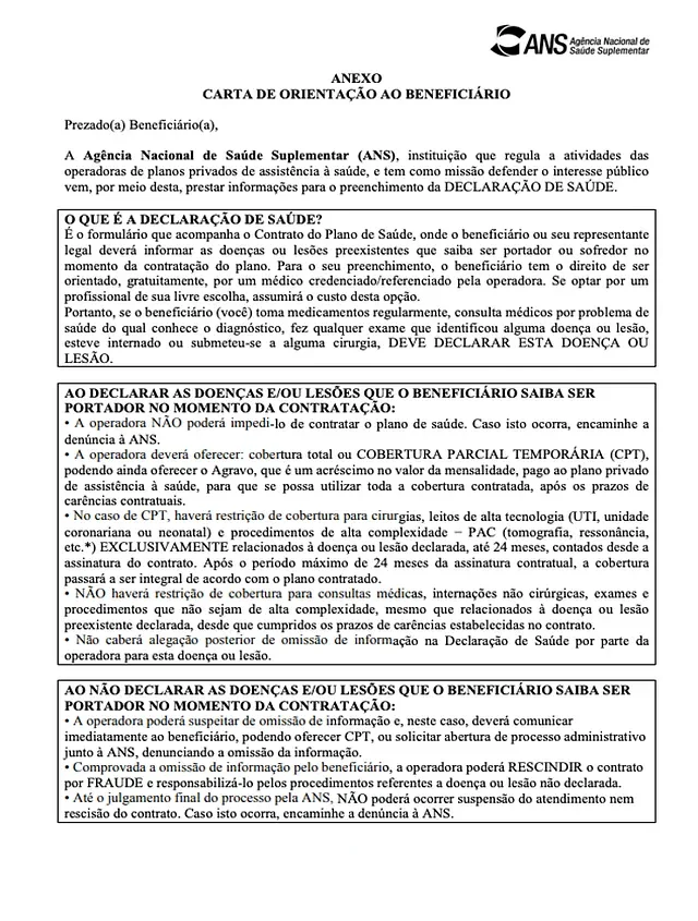
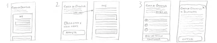
Beneficiary’s Orientation Letter
Mandatory attachment that has all the practical information regarding rights and duties the client needs to know at the moment of enrolling in medical insurance.
Assisted Medical Interview
Although the client doesn’t have to go through it, the insurance is required by regulations to offer assistance of a healthcare provider (paid by the insurance) to assist the insurer when filling out the form.
Health Statement
Form in which the client states all known pre-existing condition they are aware of having at the moment of enrolling in medical insurance. Failure to disclose pertinent information may lead to termination of contract.
The Problem with Omission
In both the Brazilian and American systems, the financial stakes of undisclosed pre-existing conditions are significant, just in different ways.
In the US, misrepresentation on insurance applications can result in policy cancellation, denial of claims, or even legal action for fraud. Insurers price risk based on what they know; what they don't know costs them. In Brazil, the numbers are stark. Fraud costs private health insurers nearly R$20 billion annually, and drives up the cost of medical procedures for all patients by roughly a third. A large portion of that loss traces back to one deceptively simple act: omitting a pre-existing condition on the Health Statement form.
What makes this particularly complicated is that not everyone who omits a condition does so in bad faith. Some people genuinely don't know the name of what they have. Some skim a long, jargon-heavy form and miss relevant questions. Some assume that because they manage their condition well, it doesn't need to be declared. The result is the same either way: financial exposure for the insurer, and potential legal consequences for the patient if fraud is later proven.
Brazilian courts have ordered patients to reimburse insurers for treatments covered while a condition was concealed, on top of contract termination and penalties.
The stakes are high for both sides. Which is why the form that captures this information deserves to be designed with real care.
During the pandemic, Brazil's private health insurance market grew rapidly: surpassing 49 million beneficiaries by early 2022, the highest number since 2016. Sami Saúde, a healthtech I was working with at the time, was growing alongside that wave.Like most insurers, Sami required new customers to complete a Health Statement form as part of onboarding. Unlike the PDF documents still used by traditional insurers (printed, signed, mailed) Sami's was digital. But digital in format only. The structure and logic of the form still mirrored its paper ancestors, and that was the problem I set out to solve.
The Starting Point
Rather than building a generic user, I worked from a persona grounded in previous company research: Juliana, 29, recently unenrolled from her parents' health plan after finishing college. She has Type 1 Diabetes, well-managed but increasingly hard to support through the public system alone. She's looking for private coverage and navigating the sign-up process mostly on her phone, after an initial conversation with a sales rep over WhatsApp.Juliana isn't trying to deceive anyone. But she's also not going to read four paragraphs of regulatory language on a small screen if she can avoid it. She wants to get this done and move on. She is exactly who this form needs to work for.
Understand the User

OUR PERSONAJuliana Oliveira
Entrepreneur, 29 years old
Has had Type 1 Diabetes since she was 11. It’s part of her life, not a crisis, and she manages it well
Runs a small catering business for children’s birthday parties in São Paulo’s East Side
Stays active and keeps a healthy routine: her lifestyle is her main tool for staying on top of her condition
Her biggest concern isn’t the diagnosis. It’s not knowing whether the system will show up when she needs it
“I had health insurance for most of my life and never thought twice about it. Now I rely on SUS: and it works, but I never know if it’s going to work this time. That uncertainty is exhausting.”
Click on the image above to expand. This service blueprint maps the full customer acquisition journey, from lead generation to first payment, across all frontstage, technology, and backstage touchpoints.
What the Research Showed
Rather than interviewing users directly (the Health Statement isn't a recurring experience, so finding people mid-process is genuinely difficult) I turned to Hotjar session recordings. Watching form-filling sessions revealed a pattern that was uncomfortable to see but important to understand.
Mobile adoption was low despite the fact that most customers first contacted Sami through WhatsApp on their phones. The form simply didn't perform well on small screens: poor responsivity, small tap targets, and large blocks of text that users visibly scanned rather than read.
The most telling behavior: every user who answered YES to any question and needed to provide clarification had to scroll all the way down to the Additional Clarifications section, then scroll back up to re-read the original question, then scroll back down to type their answer. On a mobile screen, that's a friction loop that compounds with every condition declared.
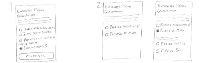
There was also a regulatory field: an offer for a Qualified Medical Interview, where a doctor assists the patient in completing the form at the insurer's expense, that almost everyone ignored. Not because they didn't want help, but because it appeared after they'd already answered everything. The timing made it invisible.
Device Distribution
Mobile Platform
87%
Google Chrome
100%
Android Phones
Qualified Medical Interview
Reading the Fine Print
58% read the QMI — before submitting or after an error prompted them to
42% never saw it
The Context That Shapes Everything
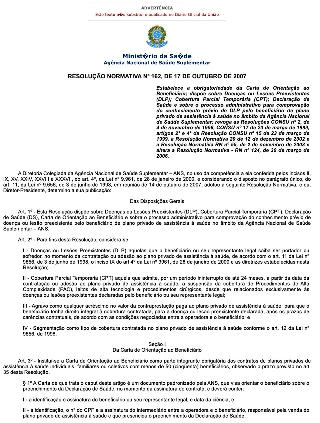
Brazil's health insurance sector is tightly regulated. Presenting orientation guidelines to the customer before they fill out the Health Statement isn't optional: it's legally required, and failure to comply risks suspension of the insurer's operating license.
The official Beneficiary Orientation Letter mandated by the ANS specifies the exact formatting: Times New Roman, 11pt, single spacing. This format was designed for paper. On a phone screen in 2022, it was genuinely difficult to read and creates an immediate sense of confronting a legal document rather than starting a health conversation.
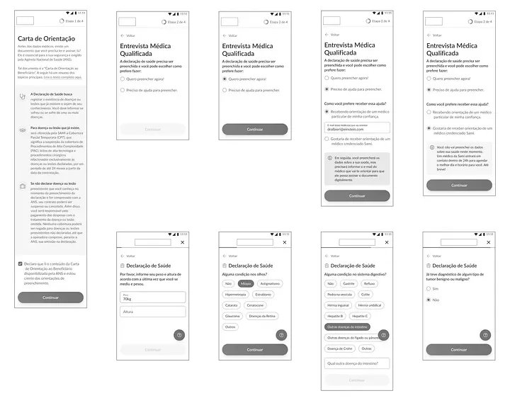
This was a constraint I had to design around, not through. The solution: surface the three most important points from the letter in accessible, plain language at the top of the form, while preserving the original formatted document within the final contract that the customer signs at the end of the process. The regulatory requirement is met. The user experience is no longer punishing.
What I Redesigned and Why
Became a scannable summary of what matters: your rights, what CPT means in plain terms, and the option to request medical assistance, rather than a block of mandatory legalese.
The orientation letter
The medical interview option
Moved to the beginning of the form, where it could actually influence how people fill it out, rather than appearing as an afterthought after the work was done.
The health conditions section
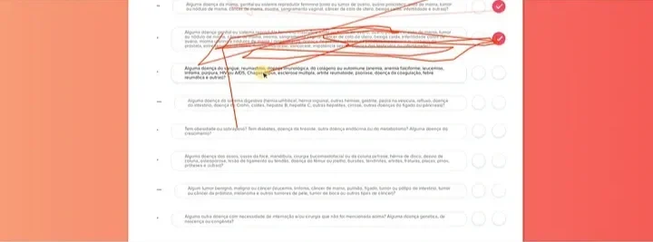
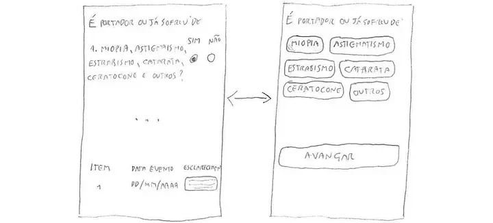
This was the most significant change. The standard format across Brazilian insurers is a list of body systems, each followed by a YES/NO question and an open text field for clarification. Every YES answer requires a human auditor to manually review the form, which means every undeclared condition that slips through does so in part because the form is exhausting to complete honestly.
Click to enlarge. Full health declaration form listing all medical conditions users must self-declare when applying for a private health plan.
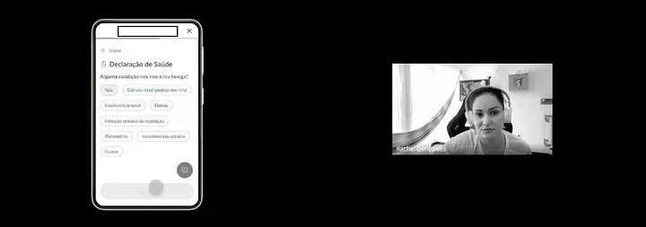
The Health Conditions Section
I redesigned this section using chips: selectable condition tags grouped within each question, linked internally to ICD classification codes. Instead of typing out a full description, a user taps the relevant chip. Common conditions are surfaced immediately. An 'Other' option remains for anything not listed.
From the user's perspective: faster, clearer, less intimidating. From the insurer's perspective: forms that would previously require manual auditing can now be processed automatically when conditions are selected from the predefined set,
reducing operational overhead and accelerating the sales process.
The parallel to the American context is worth drawing here. In the US, the complexity of insurance paperwork is a known barrier to accurate disclosure. Studies consistently show that patients under-report conditions not out of malice but because the forms are long, confusing, and feel high-stakes in ways that trigger avoidance. Simplifying the path to honest disclosure isn't just a UX nicety. It's financially and ethically important for the whole system.
Where It Ended
I moved on before completing the usability tests with real customers, and the initiative was later deprioritized before reaching production. The prototype had passed internal heuristic evaluation and informal hallway testing. Overall usability was solid, but the hypotheses around actual patient behavior, particularly around honest disclosure, remain untested at scale.
The problem it addressed hasn't gone anywhere. Forms that are exhausting to complete honestly keep feeding the R$20 billion in annual fraud quietly destabilizing the system, and a form that's easier to complete honestly is better for the patient, better for the insurer, and better for everyone whose premiums absorb the loss. Work like this waits for its moment.